
Production Logos That Haunted My Childhood Because They Seemed Oddly and Intentionally Threatening

Some of the logos I saw on TV as a child had what was likely the opposite effect. Because I really don’t think they were intended to be unsettling because why would you do that? I’m talking about the quick little bumpers announcing what production company produced whatever you just watched, or the network’s call letters for the station that broadcast it. Not horror studios, just regular everyday producers of sitcoms and the like. I’m not alone. Go on Youtube and search “scary logos”. People have put together entire compilations. Some of which I’ll show here.
In the comments for these you’ll get all kinds of internet toughs declaring how suave they are by ridiculing the poster. Yeah. They’re not scary now. I’m talking about when you’re like two or three or four and your mind is still forming and words are still meaningless symbols. To my child mind they were just mysterious shapes. With inexplicably scary and aggressive music. For instance, this Paramount Television one is clearly doing nothing but screaming at you:
I didn’t understand what the logo meant, I just understood that this mountain was very angry and might want to hurt me.
What about the “Viacom V of Doom”? I’m four. I don’t know what Viacom is. I can’t read. All I understand is this giant cold blue triangle is coming for me. With an ominous, ever loudening rumble and cold soulless synth music.
This one didn’t just mess me up. It apparently had an effect on Seth MacFarlane as there was a gag on The Family Guy in which the mysterious video in The Ring that kills people upon viewing was in fact just this end of show bumper.
Here’s another one that would make my skin crawl, sitting alone in a darkened living room…
Because there’s nothing scary about a barely seen being sitting in the dark, slowly turning to face you at a painfully plodding clip while ominous cold winds blow and sparse, doom-leaden piano plays…
The Dic one? I was old enough that it didn’t bother me. Seeing this just meant Dennis the Menace was over and the bus would be here soon. And I’d have to get on it and be taken away to middle school which was for the most part a hellish gulag for me. But I watch it now and wonder what whoever it was that thought this was a good idea was thinking.
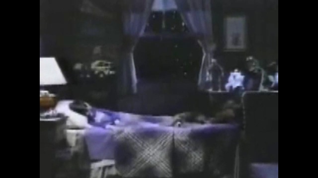
A kid sleeps peacefully in his bad at night…
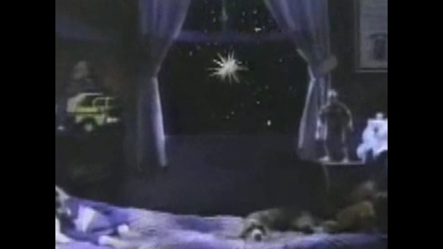
Completely unaware of the Lovecraftian horror that awaits outside his window, something that is not at all a common source of fear for children…
It’s a being of spikes. With no discernable face or understandable structure of any kind, yet it’s alive, and seems to have no purpose but to murder in unimaginable ways…
If you grew up in Boston, you’ve watched WGBH. When I simply hear this jingle:
…my skin crawls. I can’t explain it. Except that maybe to my young child’s mind that burbling “sound”, I wouldn’t even call it music, meant nothing but strange, ominous, digital things afoot. Or maybe it’s because once the logo is finally formed, it vaporizes itself. Or maybe because synthy music like that is just not fuzzy inducing. It’s cold. It’s not human. Especially that tone. And they seem to love it so much they kept using it.
This PBS logo does the same thing, beginning with a descending rattle of death before settling into music by and for robots who would prefer a human with the same lifeless, expressionless, eyeless face as on that P and seems to think that’s how “B’s” and “S’s” look.
This one is no improvement…
You couldn’t get away from them because they surrounded Sesame Street and Mr. Roger’s Neighborhood and The Electric Co.
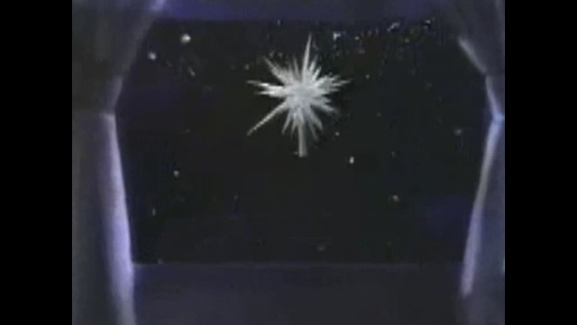
There was something about WGBH Channel 2 Boston that always made me uneasy. Maybe because back before everything went digital, the station had a lot of technical difficulties and would go down fairly often, which would mean I might miss my beloved programs. And instead would have to contend with being stuck in my high chair, staring at some strange title card while listening to a fucked up disco version of the Close Encounter’s Theme.
One of many things that may have led to the time I had an actual real nightmare about the Channel 2.
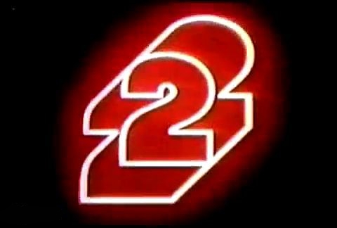
It was projected huge on the kitchen wall of the house I lived in until I was three. And it was accompanied by inexplicably scary and aggressive music. And I couldn’t get away.
Something about these things made me feel unsafe and I may never really understand why. I get a twinge of it now just reliving them. But it’s nice to know that I’m not the only one. Childhood is a weird time and I’m not saying these logos are in any way responsible for a countless many of the neurosis that plague me now. But I’m not saying they don’t either.
